GPT and Brandwatch: what does AI technology mean for the future of social listening?
What’s new in Brandwatch?
This year, Brandwatch has steadily been releasing a new integration with GPT with the intention of adding more power to their social listening tools. As the first company to provide an AI search of online data, it is well-placed to bulk up their offering with new insights. We’ve been working with a beta version of the new tool, which is now available on the wider platform.
What does GPT offer in Brandwatch?
- Conversation insights – removing the need to sift manually through mentions, GPT will be able to summarise themes from a dataset of raw content very quickly
- Writing assistant – from spelling and grammar corrections, through to copy suggestions based on user inputs
- Content insights – quantitative insights on how your content, or that of your competitors, is performing
How is the new tool faring?
Having been using the beta version of the new AI tool, we’ve found that it offers some great benefits.
Firstly, we can now dig both deeper and more broadly into issues that audiences are talking about. Brandwatch has always offered comprehensive samples of social mentions, but now GPT is able to summarise huge tranches of them, and sum up what they have to say.
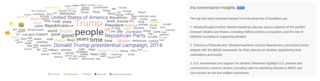
This has real-world benefits. Recently, we noticed that conversations around climate change had increased significantly week-on-week. We ran some adverts around climate change, and they performed well while that topic was trending, gaining a ROAS of 5:1.
Secondly, we can now uncover popular phrases and phrasing regarding certain topics. Take, for instance, the earthquake in Turkey and Syria in early 2023. If online audiences are calling it the Turkey-Syria earthquake, rather than Syria-Turkey earthquake, then we can use that more popular phrasing in adverts to improve audience recognition of the issue.
What does this mean for the future of social listening?
At its most basic level, the integration of GPT with Brandwatch will make social listening much easier and more effective. It means no more manual scrolling through huge volumes of mentions to find trending topics, and a more effective way of tracking popular phrases. We’ve already been able to use it in real campaigns to improve performance.
What makes a successful donation form?
Last year we wrote about how to build the perfect donation page, focusing on areas such as strong hero sections, engaging storytelling and answering questions. While we discussed some aspects of donation forms, such as placement, as the donation form is such a key component to the donation process, we felt that looking at the aspects that make up a successful one deserved its own post.
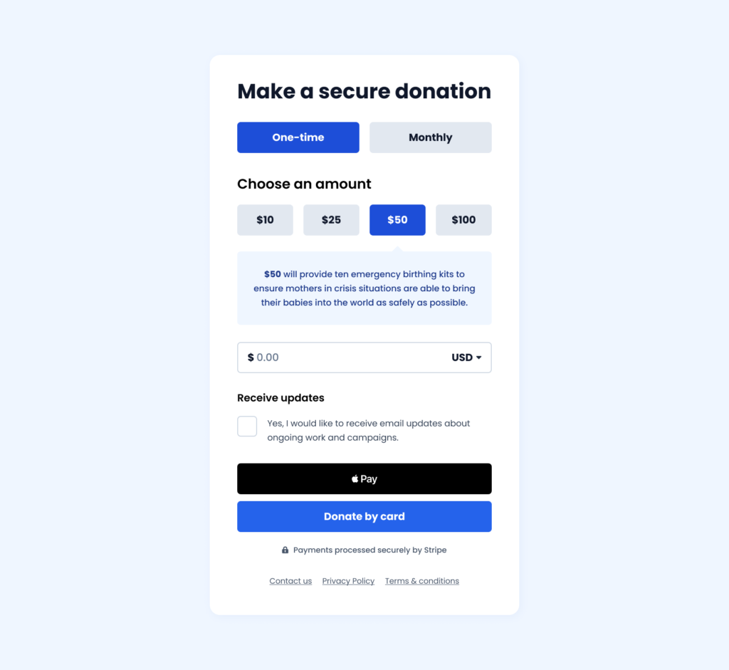
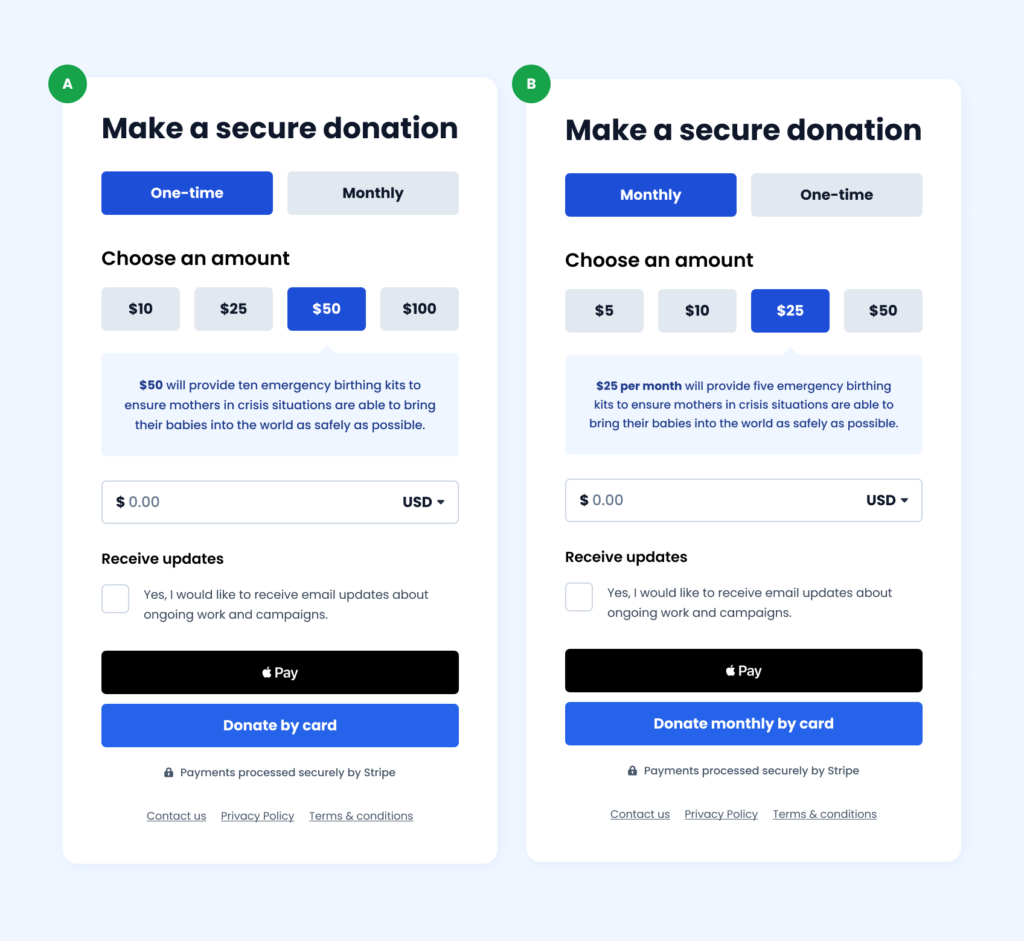
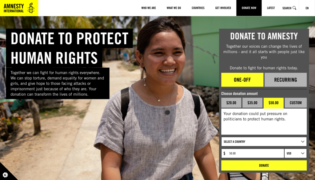
Here is our current best performing donation form. This has been developed based on years of testing. The design of it is made up of four key aspects:
- Freedom
- Aesthetics
- Context
- Transparency
Or FACT for those that are fans of a good acronym!
Freedom
It is essential to allow the user control of the donation form, for them to pick whichever method works best for them. Providing freedom, flexibility and most importantly choice. Of course it’s crucial to strike a balance as too much choice can leave the user feeling overwhelmed and mean they don’t complete the journey, so providing defined options can help.
The ideal donation form would provide choice in the following ways:
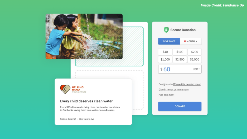
- Payment frequency: Providing single and monthly donation options for users to control the frequency of their payment.
- Donation amounts: Providing multiple suggested donation amounts specific to the appeal. Usually a small, medium, large and extra large amount (see below).
- Other amount: Providing a form field where the user can enter their own amount if needed separate to the donation amounts.
- Currency selection: Providing multiple currency options for the user to select based on their location, language or preference
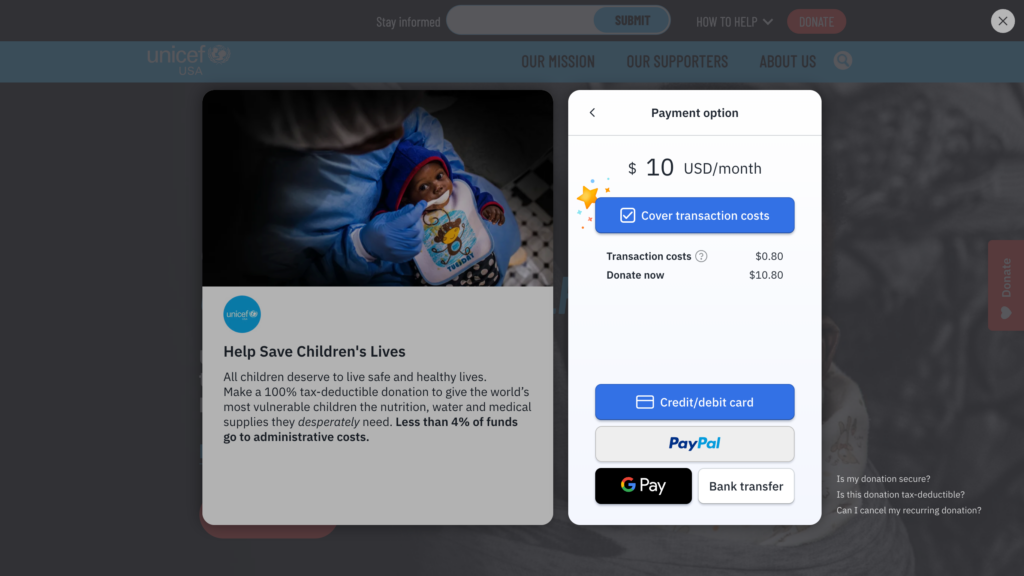
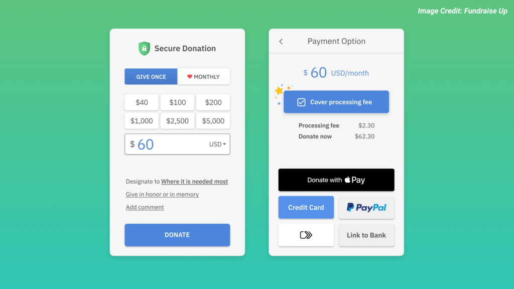
- Payment methods: Providing multiple ways to donate to speed up the process, including Card, Apple Pay, Google Pay, PayPal as well as local methods such as Direct Debit in the UK or iDEAL in the Netherlands. Platforms like Stripe and Fundraise Up support this.
Some users may want to make a donation on behalf of a friend or loved one, so providing a way to do this such as ‘In Memory’ can support this.
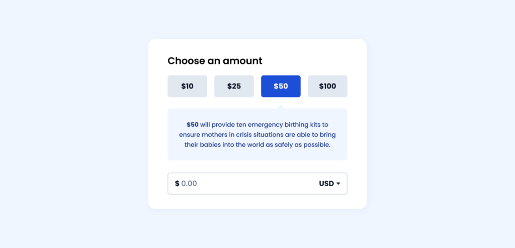
Aesthetics
Creating a functional and usable donation form doesn’t need to be at the expense of good visual design. Providing an engaging but logical aesthetic can help support the process. The ideal donation form priortises this in the following ways:
- Mobile friendly: Providing a responsive design to ensure the form is optmised for mobile devices. This includes sizing elements for touch interaction and reorganising content to follow a logical order.
- Defined colour palette: Providing different shades of branding colours to highlight key areas. For example using a base colour for submit buttons with darker shades for selected options and lighter shades for backgrounds and content (see below).
- Legible text: Providing font-sizing that follows a hierarchical structure and offers a strong contrast to be readable for all users. Using clear headings and labels also helps with this.
- White space: Provide spacing and padding around elements to allow the design to breathe and not feel cluttered. Allowing for this helps to focus elements and provide a logical order to the form.
Context
The primary goal for the user is to make a donation so providing context in the form of visibility, recognition, error prevention/recovery and documentation is vital to ensure this:
- Provide feedback: Inform the user how the form is responding to their interactions. If they have selected a donation amount, the form should reflect this by changing the state of that button.
- Explain why: Inform the user around the impact their donation will make. For example providing text under donation amounts “$25 provides food for a child for one week” or explaining why a monthly donation is preferable.
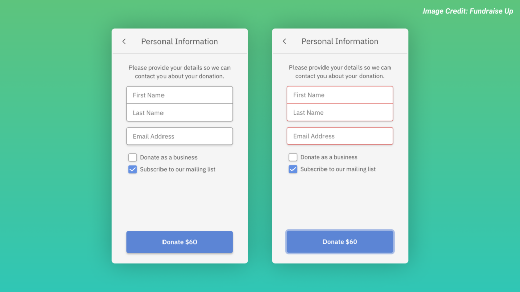
- Error handling: Provide clear messages to help users recognise, diagnose and recover from errors. While error prevention is ideal, users might still make a mistake. Helping them correct this and get back on track is vital (see below).
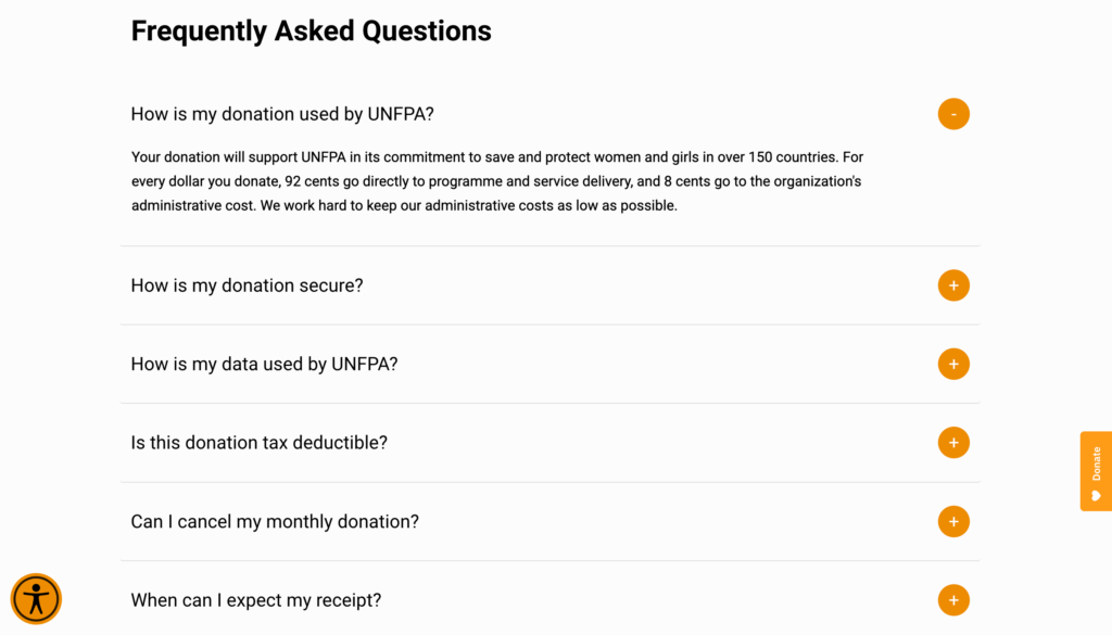
- Key links: Providing links to relevant pages or sections below the donation form can help to inform the user and answer any questions they might have. This can include FAQ’s, Contact, Privacy Policies or Terms and Conditions.

If it is a long form with multiple steps then providing a step indicator to show the progression can help manage the users expectation.
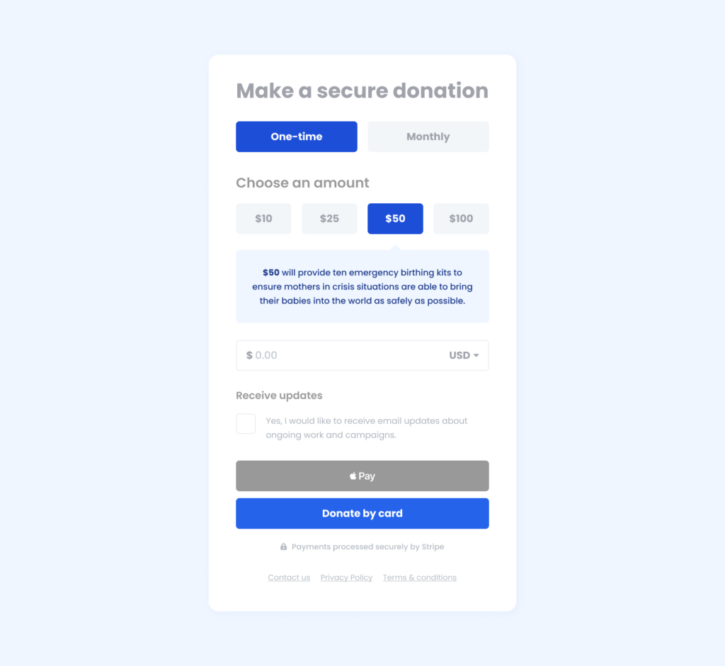
Transparency
Finally the form needs to be open and transparent to the user by maintaining consistency and standards. Doing this helps to build trust with the user and manages expectations:
- Secure donation: Inform the user how their donation is secure by providing information around the payment gateway and data management. Even providing a padlock icon alongside the form can go a long way.
- Email opt-in: Inform the user that they can opt-in for email updates and what they should expect in terms of information and frequency. Unless exempt, this option should be unchecked by default to conform with GDPR, CCPA etc (see below).
- Essential fields: Only include required fields within your form. Each field adds more time for the user to complete so making it is as simple as asking for only essential information to make a donation.
- Clear buttons: Ensure buttons are labelled accurately to reflect their purpose and inform the user of what to expect next. If using a long form with multiple steps use buttons labelled ‘Continue’ instead.

Testing
So now you have your donation form, it’s time to test it. We have previously written about the value of user testing and how important it is to the design process. The two primary ways we test donation forms are:
- Usability testing: A qualitative research process where users from your target demographic (based on age, gender, device, location etc) are asked to complete a task or tasks related to your product while observed by a facilitator.
- A/B testing: A quantitative experiment process where two or more versions of a variable, such as a landing page or component, are shown to different segments of website visitors at the same time to determine which version has the greater impact.
Usability testing is good to implement during the visual design or prototype stage so you can identify any issues early on where it will cost less to fix before development.
A/B testing is best to implement during the development stage so you can track and measure the results with real visitors.
There are many areas you can look to test including:
- Donation amounts: Try testing higher or lower donation amounts to see how it impacts conversions.
- Monthly vs one-time: Try testing where the monthly or one-time donation frequency is prioritised by default to see if it increases monthly donors (see below).
- Button labelling: Try testing different labelling options on your submit button to see how it impacts conversions and engagement.
- Old design vs new design: Try testing your old donation form vs an updated version based on these principles to see how it impacts conversions.
Using these guidelines alongside good design principles and accessibility standards can help create a successful donation form with a positive user experience that leads to more conversions. If you are not able to easily make changes to your donation form then using third party platforms such as Fundraise Up can help with the process.
How to optimise your website performance and page load speed
Why is it important?
Page load speed can be a critical factor in getting potential donors over the line to complete their donation. It can impact many aspects of your website including:
User experience
Ensuring a fast-loading website helps to increase user satisfaction and engagement. Conversely, a slow-loading website can lead to user frustration and abandon the process altogether.
Conversion rates
Slow-loading websites are one of the most common reasons for higher bounce rates, reduced donor engagement and lower conversation rates.
Search Engine Optimisation (SEO)
Google includes page load speed as a ranking factor in their algorithm so ensuring your website is fast-loading can help to improve your search engine ranking.
Other benefits include mobile optimisation, especially for those on slower internet connections or costly data packages. It’s not just the user that this affects though as slow-loading websites can use more bandwidth, increasing costs for your organisation.
How to test performance?
There are many free and paid services available to help track website performance, but here are some we find most helpful:
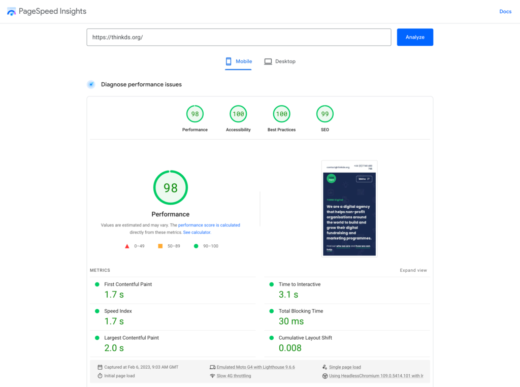
Google PageSpeed Insights
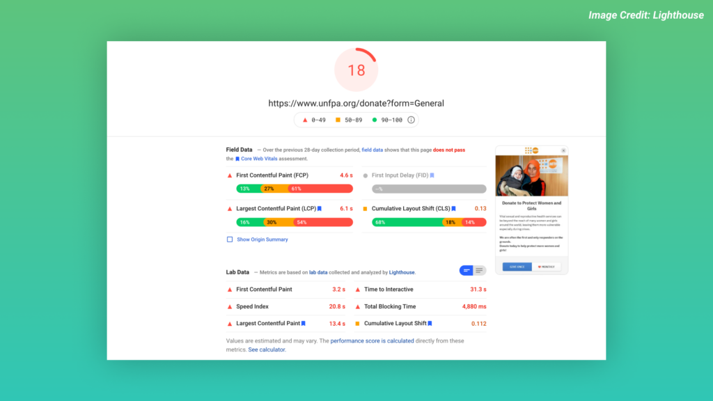
A free tool that provides a score for the performance of any website URL (for both mobile and desktop) as well as recommendations to improve the score. https://pagespeed.web.dev/
Browser Dev Tools
Whether you use Chrome, Safari, Edge or Firefox, all major browsers provide developer tools to monitor the performance of your website. The “Network” tab allows you to see how long it takes to load resources such as images, scripts and stylesheets and the impact it has on your site.
Monitor Tools
If you want to track performance over a longer period you can use monitoring tools like Google Analytics to view detailed reports on various metrics such as page load speed.
How to improve your page load speed
Improving the page load speed for your website will require a combination of front and back-end changes. The most common improvements include:
Optimising images
Spending time optimising assets such as images can help to make page load speed faster and less data consumption. Using modern image formats such as WebP and AVIF can be helpful but general compression alone can provide significant savings to users.
Minimising requests
Be mindful of what assets are being loaded as they can significantly slow down your page load speed, in particular third-party scripts from Facebook, Google, YouTube and Stripe. This can be avoided by only using code that is needed on specific pages or deferring loading until they are required.
Minifying HTML, CSS and Javascript
Files are often larger than they need to be. Minifying them, a process that removes white space, comments and line breaks in your code, can help to reduce bandwidth and make pages load faster while maintaining all design elements and functionality.
Enable caching
When users navigate to a URL in their web browser, the browser makes a network request to fetch that content, and then your server receives the request and returns the page content. Optimising this to work as quickly as possible, by using a cached version of your website can help to speed it up.
Use a Content Delivery Network (CDN)
A CDN uses a network of servers around the world. When a user visits your website, they are served a cached version from the closest available server to their location. This, alongside fast and reliable hosting, will help to reduce latency and make your site load faster.
Implementing these simple improvements alongside regular testing and monitoring can ensure landing pages load quickly for your donors, leading to higher engagement and increased conversion rates.
How to build the perfect donation page
Start strong
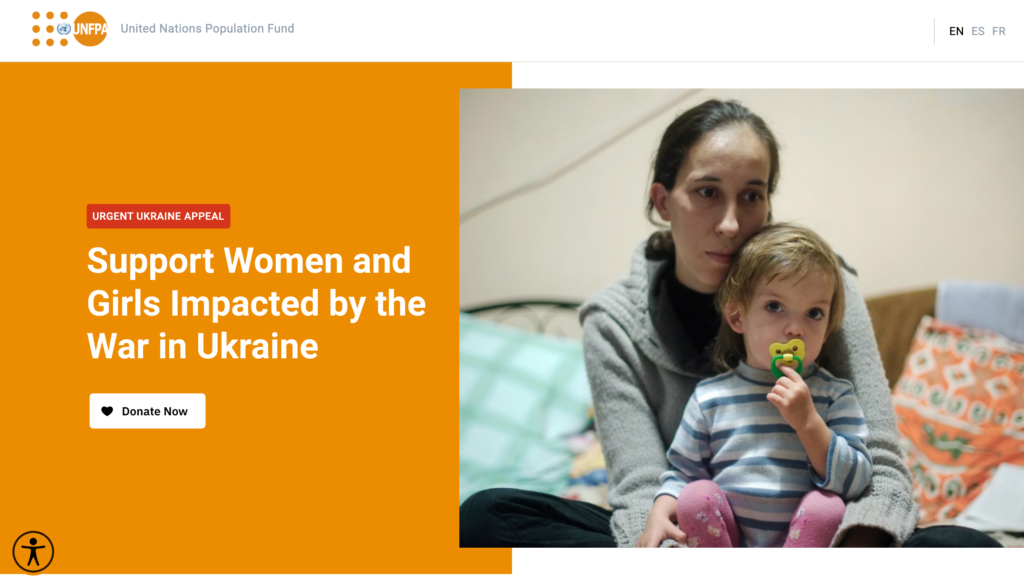
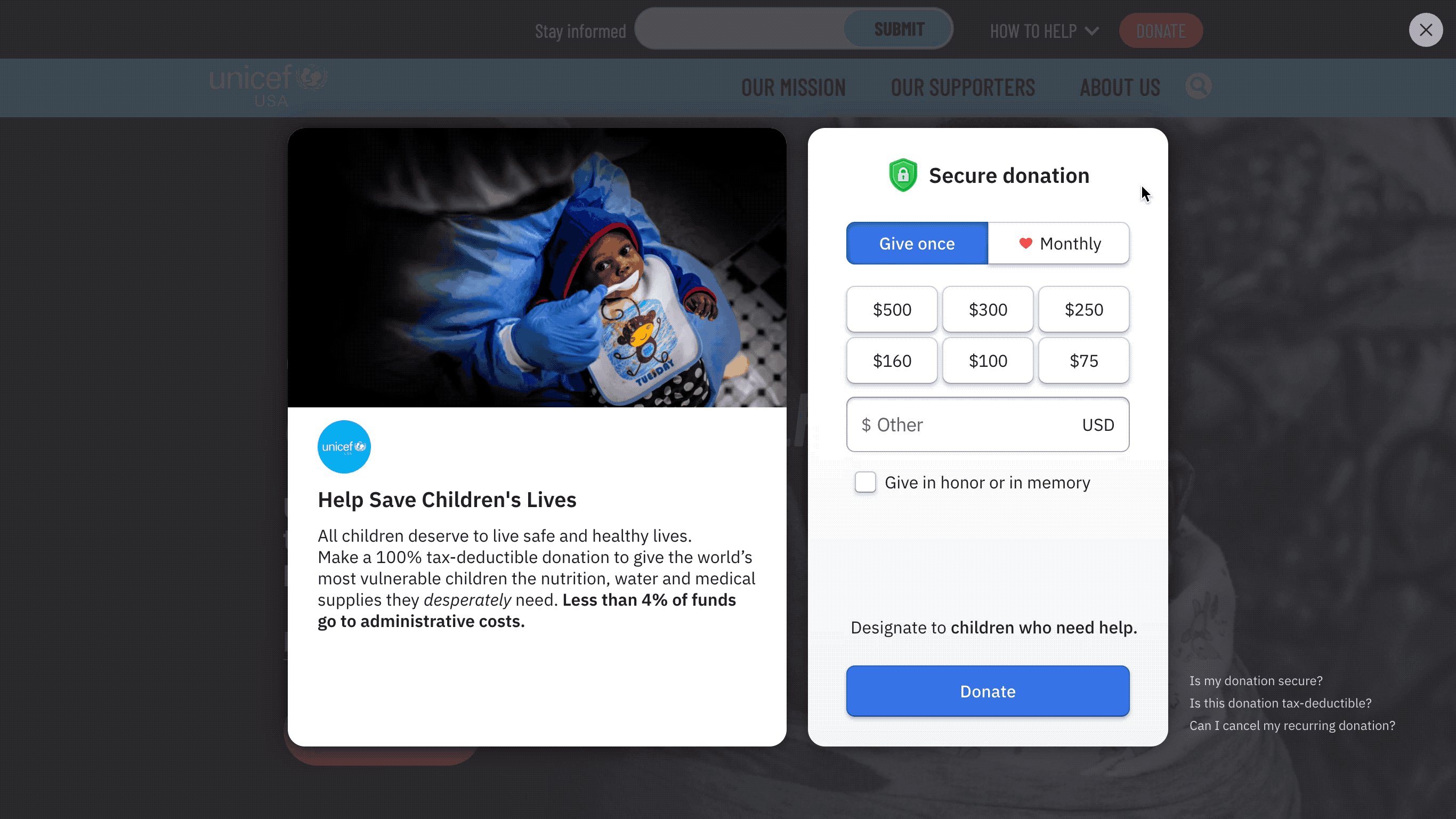
Most donation pages usually start with a hero section as this is the first thing your users will see. It is important to present strong and impactful content that will connect with the user and elicit an emotional reaction. The hero will often consist of three key elements: the image, the headline and the call to action.
- Image – This should be emotive and impactful. Ideally it should focus on a particular subject and be presented clearly in a high resolution. For some campaigns, it may be more effective to use a video instead of an image – but this can impact page load speed.
- Headline – This should be clear and concise. It should let the user know the purpose of the campaign and how they can support, e.g. “Support Women and Girls Impacted by the War in Ukraine”.
- Call to action – This should be succinct and direct. It should let the user know what you want them to do e.g. ‘Donate Now’.
It is also important to ensure that this section reflects the assets presented to the user before landing on the donation page e.g. when clicking a Facebook ad. This consistency assures the user that they have reached their intended destination and gives confidence to proceed with the process.
Tell your story
As with the hero section, the main content should be designed to inform and connect with the user. It should tell them what the problem is, how the organisation is working to solve the problem, and how their support will help.
- What’s the problem? – Be clear on what the issue is and build in as much emotion as possible. Include a case study and images if possible.
- How is the organisation helping? – What are the things the organisation is doing to try to address the issue? Use clear bullet points, be as specific as possible, and ideally include concrete examples with costs (ie ‘We are providing emergency care for expectant mothers in crisis affected areas. It costs $100 to provide emergency care to one pregnant woman’).
- How can you help? – If the above has helped the user to connect with the issue you now need to provide them with ways to help. Explain what their donation will help achieve and again include tangible examples where possible.
Form placement
The main purpose of your donation page is to convert users into donors. To do this they will need to make a payment via the donation form. Where this is placed on the page can have a significant impact on your conversion rate.
Placement of the donation form is often found embedded in the donation page itself or a separate page that is linked to via a ‘Donate’ button. Whilst the separate page can help to keep the donation page clearer it adds another step to the user’s journey and can add extra time needed to load the pages.
Keeping the user on the donation page allows them to take in all the information around it that can help inform their decision to donate. The key is to provide multiple entry points to the donation form. If the form is embedded in the hero section, provide links to scroll back to it further down the page. If the form is displayed as a modal window (popup) over the donation page, ensure there is a way for users to get back to it if they exit the process.
Answer questions
Even if a user believes in a cause and wants to donate, there may be other factors that can impact their decision making process. Try to get ahead of this by including answers to Frequently Asked Questions (FAQs). These can include:
- How is my donation used?
- How is my donation secure?
- How is my data used?
- Is the donation tax-deductible?
- Can I cancel my monthly donation?
As an organisation, you will never want your users to cancel their monthly donation but if they know in advance how they can do that, it helps them to feel in control of their donation and the process as a whole.
Other common questions such as how secure the payment is or how personal information is used can be massive issues if they do not match the user’s expectations so letting them know this up front can help to alleviate any fears.
You won’t be able to answer every question with a FAQs section so providing ways for a potential donor to contact the organisation to ask specific questions also helps them to feel comfortable with the process.
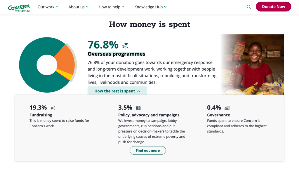
Be transparent
Finally, it is important to provide transparency with users by sharing key information such as breakdowns of how donations are used.
If a user is giving their money to a non-profit organisation they want to know it will go towards those that need it most. It is accepted that some will need to go to administration costs but sharing this information is a better policy than hiding it.
Providing this data alongside graphs or charts helps to build trust in the organisation for the user and remove any potential hurdles to completing their donation.
Final thoughts
There are many aspects that go into a successful donation page. We would always advise that, as well the five points listed, pages also follow usability best practices, accessibility standards and performance metrics. Ensuring your donation page includes all these elements will ensure that you maximise conversions.
At THINK Digital, we are able to help support and implement donation pages and donation campaigns. We can also conduct UX reviews on existing donation pages to highlight areas for improvement. If you would like to know more, please contact us.
How Fundraise Up can drive new monthly donations
It’s no secret that here at THINK Digital we are big fans of the digital fundraising platform Fundraise Up and have even written previously about five things we like about the platform.
Having used Fundraise Up for multiple international clients over the past year, one of our favourite aspects of the platform is the the way it is optimised to turn more supporters into recurring donors.
Encouraging monthly donations
Clients are able to customise the interface to prioritise one-time or monthly donation options, By default, Fundraise Up highlights the importance of giving monthly, using a heart icon that animates when the user clicks the monthly option.
It is a small detail but one that adds a playful interaction to the process and encourages the user to select the monthly option.
Multiple Payment Methods
Once the user has selected a monthly donation amount, they are able to complete payment in a number of ways that support regular giving.
Standardised methods such as Credit/debit cards are included alongside third party options such as Paypal, Apple Pay and Google Pay. Depending on the donor location, there is also the option to donate via BACS (UK Direct Debit) or ACH (US Direct Debit) and other localised methods.
Allowing the user multiple ways to give monthly ensures they feel in control of the process and provides freedom to the choices they make.
Convert to a monthly donation
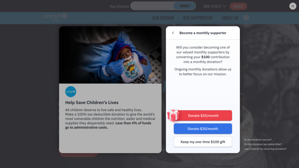
Even if the donor only wants to make a one-time donation, Fundraise Up might convince them to become a monthly supporter instead as they go through the donation process.
After selecting a one-time amount, the donation process presents the user with the option to convert to a monthly donation, suggesting an amount based on their one-time gift and explaining how an ongoing monthly donation can support the organisation in their mission.
This is also repeated at the end of the one-time process where you can convert to regular giving, post-donation.
Final thoughts
The tools provided by Fundraise Up help to ensure an easy process for users to become monthly donors. Using these alongside a long-term regular giving strategy can help drive new monthly donors, convert one-time donations and provide recurring support for the organisation and their mission.
Read more about Regular giving on Fundraise Up.
—
At THINK Digital, we work directly with clients to provide long-term recurring giving strategies and improve their online digital fundraising. If you would like to know more, please contact us.
Six months on, how Facebook’s new targeting restriction’s are working.
Earlier this year, we outlined how Facebook’s new targeting restrictions could affect the ability to find customers in Ads Manager. Six months on, how are the new restrictions working, and how can advertisers now find their audience?
What targeting has been removed?
In midwinter 2022, Facebook removed the ability to target users by anything that could be interpreted as sensitive, including:
- Religion
- Health
- Race or ethnicity
- Political affiliation
- Sexual orientation
This has made targeting users during religious festivals, or for political and social campaigns, much trickier than it used to be.
What options are available?
Broad targeting, Custom Audiences and Lookalike Audiences are still available, although the last two rely on having a good database of customers ready to upload to Audiences.
Facebook has also introduced Advantage Lookalike, where adverts may be shown to more people than the standard 1-10% threshold if it is likely to improve performance.
How can advertisers target users?
Here are some of the techniques we’ve been using to replace interest targeting:
Location targeting
target by location to try to narrow down your audience. If your adverts are aimed primarily at Catholics, for instance, target locations where Catholics make up a good proportion of the population. A quick Google search can provide this information. Similarly, if you are running ads for Pride month, it makes sense to target cities hosting Pride events, particularly around the time that those events are running.
Icons and popular entertainment
While many targeting options have been removed, celebrities, artists and entertainment choices remain in place. If you can find a way to use broad brush strokes then you can identify an audience by its affiliations. The films of John Waters, or Arabic Pop Music, or the satire of Jon Stewart – all are more likely to be enjoyed by sections of the population you are otherwise unable to target.
Combination targeting
While specific targeting may be off the table – women’s rights, for instance, or feminism – you can use combination targeting to get as close to the interest as possible. Let’s say you wanted to run pro-choice adverts. Targeting users interested in Planned Parenthood or Women’s Health is no longer possible. But if you target women in Democrat-leaning states, or in locations where abortion is set to stay available, and then combine that with an interest in human rights, pregnancy and feminist icons like Simone de Beauvoir, then you might get close to targeting exactly who you want.
There is no doubt that Facebook’s new targeting restrictions have made it harder to specify an audience, particularly if you are running a religious, political or social campaign. Facebook is always refreshing the way it works, although these changes look set to stay. However, with a bit of creativity or a good customer database, it is still possible to find an audience who will engage with your campaign.
How can we mitigate against the phase out of cookies and changes to iOS?
What is the issue?
Earlier this year, Google announced that Chrome would no longer support third-party cookies from the start of 2024, and Apple has released the option for users to block identifiers for advertisers by default in iOS14. These issues are already having an impact on tracking and will lower return on advertising spend (ROAS) for non-profit organisations which are fundraising through digital channels once cookies disappear if mitigations aren’t put in place now.
This increases the need for organisations to maximise the way they store and tag CRM data to build as full a picture of current donors as possible to give the organisation more chance to be able to find people like them to recruit in the future.
What are the possible mitigations currently in play?
Technically, even if third party cookies are being removed, all major ad networks still use first party cookies – providing safer and more compliant visitor tracking. The knowledge of advertising audiences or visitors is not lost. In some cases, it can even be improved thanks to smarter AI resolution. In addition, the digital advertising industry is trying to minimise the impacts as it’s in our interests.
Solutions like Unified ID 2.0 attempt to replace third party cookies with an alternative identifier that’s tied to hashed and encrypted email addresses. This may or may not work, but many other solutions are vying for pole position currently. However, non-profit organisations aren’t in control of this, so it makes sense to proactively mitigate risks in case all of these proposed solutions fail.
What can your organisation do?
- Build the current donor base as much as is possible, perhaps accepting a lower ROAS.
- Focus on regular givers will also help build a stronger, more resilient programme.
- The issue of tracking, due to Apple’s changes, is less of a fundamental problem as cookie switch off, as you still get the donations, you just can’t track them in Facebook. However, this has and will impact ROAS as it is no longer as easy to scale spend with incomplete data in Facebook Business Manager. The mitigation here is to learn what ROAS within Facebook means a good ROAS overall and build your own logic and tools to manage the scaling issue.
- Maximise the data you collect and store this in your CRM in a way that is actionable in improving your marketing efforts. This means developing your unique playbook for improving data capture, integration, analytics, and insights for targeting and offer personalization for conversion.
- Use techniques such as social listening to get a deeper understanding of what the sorts of people who are likely to support you are talking about and how you can make your messaging more relevant to where they are at that specific moment and what sorts of language they use.
- Start to use AI, which has a crucial role to play at the point of transaction using factors such as time of day, location of visitor and any other information we are allowed to factor in to build logic in the giving experience to maximise revenue without the need for cookies.
Facebook’s new targeting restrictions: what does it mean for advertisers?
In Autumn 2021, Facebook announced significant changes to the way advertisers can target prospective customers in Ads Manager. These changes came into effect in mid-January 2022, and have reduced the possibilities for advertisers looking to expand their current audience.
So what are the changes, how are advertisers affected and what are the options for future targeting?
What will be affected?
Facebook has clamped down on any targeting that could be interpreted as sensitive. Topics viewed as such include:
- Religion
- Health
- Race or ethnicity
- Political affiliation
- Sexual orientation
This doesn’t just apply to specific interest targeting, but also any events, figures or organisations relating to that topic.
For instance, if you wanted to target Catholics, prior to 19th January Catholic Church was available as a targeting interest. Now, not only is that keyword unavailable, but so too is Pope Francis, The Bible and Baptism.
Feminism, as another example, is also off the table, along with associated terms such as Women’s Rights, Hilary Clinton and Planned Parenthood.
What targeting remains available?
This is clearly a big hit for organisations hoping to target people with quite specific – albeit supposedly sensitive – interests. So what is left for advertisers to target?
- Broad targeting remains in place. Advertisers can still find prospective customers by gender, age, language and location.
- Custom Audiences, uploaded from an advertiser’s own data, or gathered from website or app traffic or engagement on Facebook, is unaffected.
- Lookalike Audiences also remain available to use, as they are based on Custom Audiences.
What are the options for advertisers?
As things stand, here are the options for advertisers:
- Follow Facebook recommendations for existing audiences. If an advertiser already had an audience up and running as of 19th January, it will continue to run until 17th March. It may need to be updated with recommendations from Facebook, although it is now clear yet what those recommendations will be.
- Set up a broad targeting audience – by age, gender, location and language – and allow Facebook’s algorithms to do the rest. Again, it is not clear how Facebook will find the correct audience for broadly targeted ads, but it supposedly tracks the language used in the advert to allocate interests.
- Do as much analysis on your own Custom Audiences as possible. Sort your data by campaign, date, or any other information available to make your Custom Audiences as specific as they can be.
- Find some workarounds. A few years ago, Facebook removed the ability to target Muslims through specific keywords like Islam or Muslim. However, terms such as Ramadan and Eid were still available, allowing advertisers interested in a Muslim audience to target them reasonably well. Similarly, while Feminism and Women’s Rights are now excluded, lower-profile feminists like Simone de Beauvoir are still available.
Facebook are always updating and amending how Ads Manager works, so who knows how long the current restrictions will stay as they are. It may be that, if results suffer, advertisers are drawn away from Facebook, forcing a backtracking or alteration to this new regime. We’ll be monitoring the changes closely and seeing how they effect the targeting we do for fundraising campaigns, stay tuned for updates on this over the coming months.
Five things we like about Fundraise Up
Fundraise Up is a digital fundraising platform that is designed to use AI to empower non-profit organisations. Recently, we worked with UNFPA to help them migrate their campaigns and donation processes over to Fundraise Up – our first time using the platform. So based on that experience, here are five things we like about Fundraise Up (and a couple of things we think could be better).
1. Checkout and Elements
Fundraise Up uses elements to offer a variety of tools to build your fundraising experience. These components are added to your page with just a simple line of code and can be easily customised to match the look and feel of your page. Elements include donation buttons and reminders, goal meters, image cards, top supporters, and peer-to-peer fundraising.
Fundraise Up’s most important element is Checkout – an embeddable form that works within your site. The component allows for an end-to-end donation process without the need to be redirected away to complete the donation.
This can be customised with a multitude of options such as donation amounts, monthly options, donation up-sells, and confirmation emails to create an experience unique to your appeal.
Read more about Elements and Checkout.
2. Payment Options
Fundraise Up offers a number of payment options to give donors flexibility in making a donation. The platform is an official partner of the payment gateway Stripe. This allows payments to be made using a variety of credit cards as well as services such as Apple Pay and Google Pay. Donors are also able to use PayPal and bank transfer.
The platform allows for all worldwide currencies to be used alongside these payment methods and harnesses geolocation to serve the relevant currency, donation amounts and payment methods based on the donor’s location.
Read more about Payment Options.
3. Machine Learning
Perhaps the most powerful feature of Fundraise Up is Machine learning. This uses an algorithm that analyses patterns in donor behaviour to determine the optimal donation amounts to use. This helps to ensure that the amounts don’t ask for too little (risk missing out on potential donations) or too much (risk losing the donation altogether).
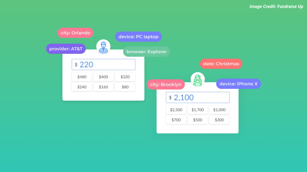
The algorithm can analyse donor behaviour through data points such as location, device or previous donor history. From there, it can be grouped based on common behavioural traits and donation amounts can then be personalised. It helps to create a truly unique experience for each user.
Read more about Machine Learning.
4. Analytics and reporting
Fundraise Up also allows for data to be generated to give an overview of how campaigns are performing. These reports can be connected to third party analytics tools such as Google Analytics and Facebook pixel with UTM tag support.
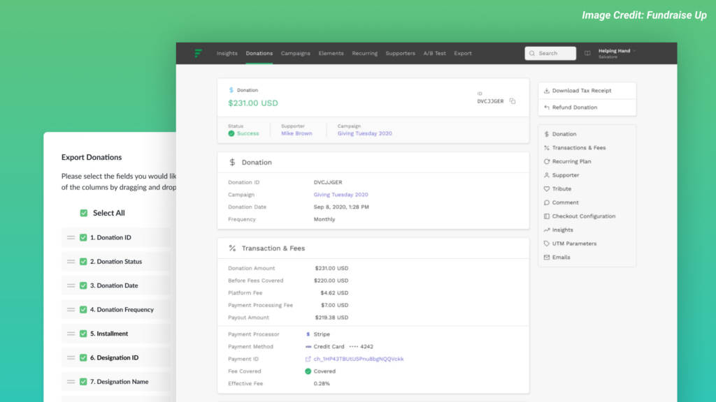
Data can also be filtered and exported so it can be used with a reporting tool of your choice. These reports can be scheduled to export at regular intervals and templates can be set so the same options do not need to be configured every time.
Read more about Data Tracking, Exports and Donation Management.
5. Security and Fraud Prevention
Perhaps the most important feature of all, Fundraise Up uses SSL and 256-bit encryption to securely handle donations without ever storing payment details. Personal data is also managed securely and the platform is regularly backed up to ensure nothing is lost.
Fundraise Up also uses Stripe Radar alongside many other industry standards to ensure Fraud prevention. Analysing user behaviour, reviewing failed transactions and putting measures in place to combat hackers helps to make a secure process.
Read more about Security and Fraud Prevention.
Other
There are many other things we like about Fundraise Up, including the design of the User Interface (UI). It is kept simple and helps to take the donor through every step of the donation process. It also offers peer-to-peer fundraising to super-charge your donation page and allow others to fundraise.
Improvements
Fundraise Up is not without its faults though. From a performance perspective, it can cause pages to run slower due to the excessive javascript required to load the checkout process. It is also guilty of some accessibility issues such as using placeholders instead of labels for form fields or not displaying clear and useful error messages to provide context for the user.
As the platform is designed to be flexible, it can sometimes cause limitations to be placed on areas such as content. This applies to the snippet of text alongside the donation form and the lack of descriptions for what a donation amount corresponds to. Finally, while content can be entered in different languages where editable, some elements are fixed to the process and so don’t work when translated.
Final thoughts
Overall, Fundraise up is a really impressive fundraising platform that can easily be set up, is highly customisable, allows multiple payment gateways, harnesses machine learning, outputs useful data analytics, and provides industry leading security. It allows any non-profit website to quickly accept online donations without the need for extra development costs.
—
At THINK Digital, we work directly with clients to improve their online digital fundraising. We have recently worked with UNFPA to help them implement donation pages using Fundraise Up. If you would like to know more, please contact us.
Designing with accessibility in mind
To create more usable products we need to understand and care about user requirements that differ from or even conflict with our own. One of the most important aspects of this is designing for accessibility. This ensures our products work, not just for some, but for as many people as possible.
What is accessibility?
“Web accessibility means that websites, tools, and technologies are designed and developed so that people with disabilities can use them.”
W3C Web Accessibility Initiative (WAI)
It can be simply defined as “the ability to access”, but more specifically it is about ensuring that people can perceive, understand, operate, and interact with the web. When we talk about accessibility, we are talking about encompassing all disabilities that affect access online. This includes auditory, cognitive, neurological, physical, speech, and visual.
When designing for accessibility, one concept is that of universal design. Where accessible design creates products that are usable by those with disabilities, universal design creates products for the widest possible audience, this includes, but isn’t limited to, people with a disability.
An example of this would be:
- Adding a button to your site to increase the font size (making it accessible).
- Making all the text bigger so more people are able to read it without needing to change the size (making it universal).
Who does accessibility impact?
According to the World Health Organisation (WHO) more than one billion people in the world live with some form of disability. This can range from everything from sight loss, hearing loss or dexterity issues to dyslexia, learning difficulties or colour blindness.
Accessibility isn’t just about people with disabilities. It can impact everyone.
We can all find ourselves in different circumstances that are situational or temporary that affect how we access the web.

Sometimes, non-disabled users will make use of accessibility features for convenience, without even realising it. For example, if you are on a train home and you have forgotten your headphones, you may watch a video on YouTube with captions on.
In this situation, your needs are the same as someone with an auditory disability.
Not all users may have a disability but they may use your website in the same way. Accessibility helps to improve the experience for everyone.
Why is accessibility important?
The main reason that accessibility is important is that it makes your website usable by as many people as possible. This not only helps maximise your target audience, but accessibility often improves overall usability. A positive user journey is good for the user and is more likely to lead to repeat visits.
There is also the legal side to consider. Through the UK’s Equality Act 2010, disabled people have the right to access everyday goods and services (for example websites). To comply with this law, reasonable adjustments must be made to accommodate these users. There are similar laws in different countries around the world.
Other benefits to accessibility include Search Engine Optimisation (SEO). Search Engines view websites similar to screen readers and poor accessibility standards can penalise a site from their rankings. Accessibility can also benefit those on mobile devices or smaller screens as well as slower internet connections.
How to improve accessibility?
There are many things that can be done to improve accessibility on your website, here are some of the most important that are quick and easy to implement:
Content and Language
Accessible content begins with well-structured copy. Clearly identifiable headings, short sentences and paragraphs make it easier to skim content and retain information. Separating out content such as lists or quotes from the rest of the copy helps to break up the page.
Language makes a huge difference to your content and striking the right tone with your users. Clear, simple and concise language makes for the most accessible text. Overusing technical jargon, acronyms, abbreviations or vague terms can be off-putting so try to avoid these where possible.

Contrast
When the text colour is too close to the background colour it will be hard to read. Ensure the contrast is strong enough to read clearly, you can use bold text to help with this. For text over images, use gradients or overlays to help. Whatever the contrast, it is important to use a font size that will be readable across the page, ideally 16px or above.

Images and Video
Adding a text alternative for an image, which is used by screen readers or when an image doesn’t load, is essential. Make the text as descriptive as possible to help understand the context of the image. For video, make use of captions and subtitles for users to be able to clearly distinguish audio. Keep the captions short and don’t forget to include important audio cues.

Forms and error messages
Forms are the key elements on interactive sites but even the simplest form can be difficult for people with learning difficulties. Keep important information on the screen at all times to refer to when needed. Make use of icons to support colour on error messages to help draw attention to them quickly. Try to use human language like “Sorry, we couldn’t find the page you wanted” instead of “Error 404” as well.

These are just some of the things you can do to ensure your website is accessible to all users. There are many more that can be included such as keyboard functionality, reducing motion and avoiding/correcting mistakes through validation.
Who is responsible for accessibility?
“Accessibility is not the responsibility of one person. Everyone on your team is responsible for making your product accessible.”
Gov.uk
Everyone is responsible for accessibility at some level. It is a collective involvement throughout the whole organisation, from project managers to developers, who all have different roles when it comes to accessibility.
It is important to create a culture of accessibility and universal design so it is part of each project from the offset and not considered an afterthought or one person’s responsibility.
—
At THINK Digital, we are able to review, test and implement accessibility standards on your digital user experience. Recent clients include UNFPA, UNICEF, Oxfam, and the Swedish Red Cross. If you would like to know more, please contact us.