Start strong
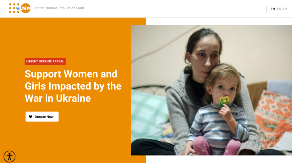
Most donation pages usually start with a hero section as this is the first thing your users will see. It is important to present strong and impactful content that will connect with the user and elicit an emotional reaction. The hero will often consist of three key elements: the image, the headline and the call to action.
- Image – This should be emotive and impactful. Ideally it should focus on a particular subject and be presented clearly in a high resolution. For some campaigns, it may be more effective to use a video instead of an image – but this can impact page load speed.
- Headline – This should be clear and concise. It should let the user know the purpose of the campaign and how they can support, e.g. “Support Women and Girls Impacted by the War in Ukraine”.
- Call to action – This should be succinct and direct. It should let the user know what you want them to do e.g. ‘Donate Now’.
It is also important to ensure that this section reflects the assets presented to the user before landing on the donation page e.g. when clicking a Facebook ad. This consistency assures the user that they have reached their intended destination and gives confidence to proceed with the process.
Tell your story
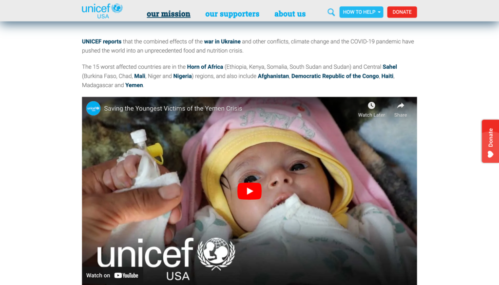
As with the hero section, the main content should be designed to inform and connect with the user. It should tell them what the problem is, how the organisation is working to solve the problem, and how their support will help.
- What’s the problem? – Be clear on what the issue is and build in as much emotion as possible. Include a case study and images if possible.
- How is the organisation helping? – What are the things the organisation is doing to try to address the issue? Use clear bullet points, be as specific as possible, and ideally include concrete examples with costs (ie ‘We are providing emergency care for expectant mothers in crisis affected areas. It costs $100 to provide emergency care to one pregnant woman’).
- How can you help? – If the above has helped the user to connect with the issue you now need to provide them with ways to help. Explain what their donation will help achieve and again include tangible examples where possible.
Form placement
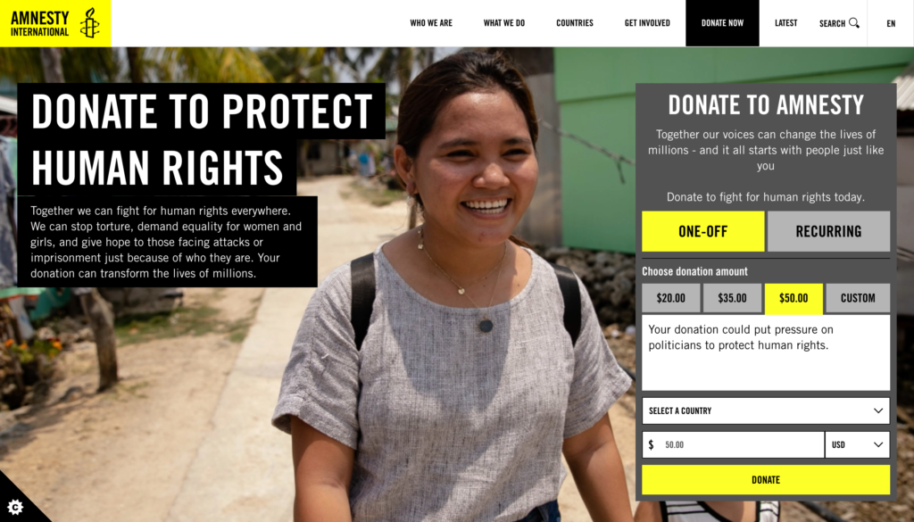
The main purpose of your donation page is to convert users into donors. To do this they will need to make a payment via the donation form. Where this is placed on the page can have a significant impact on your conversion rate.
Placement of the donation form is often found embedded in the donation page itself or a separate page that is linked to via a ‘Donate’ button. Whilst the separate page can help to keep the donation page clearer it adds another step to the user’s journey and can add extra time needed to load the pages.
Keeping the user on the donation page allows them to take in all the information around it that can help inform their decision to donate. The key is to provide multiple entry points to the donation form. If the form is embedded in the hero section, provide links to scroll back to it further down the page. If the form is displayed as a modal window (popup) over the donation page, ensure there is a way for users to get back to it if they exit the process.
Answer questions
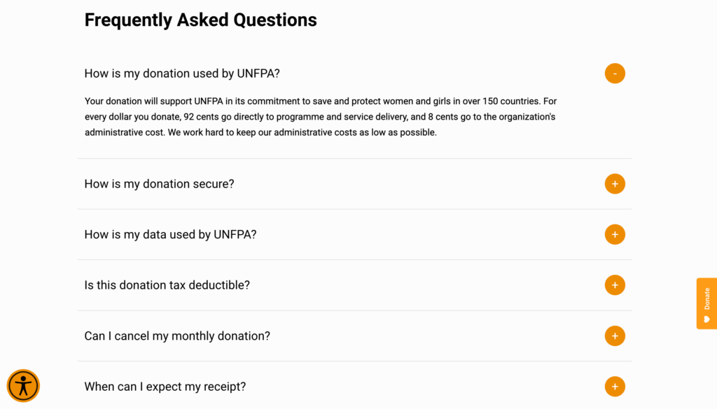
Even if a user believes in a cause and wants to donate, there may be other factors that can impact their decision making process. Try to get ahead of this by including answers to Frequently Asked Questions (FAQs). These can include:
- How is my donation used?
- How is my donation secure?
- How is my data used?
- Is the donation tax-deductible?
- Can I cancel my monthly donation?
As an organisation, you will never want your users to cancel their monthly donation but if they know in advance how they can do that, it helps them to feel in control of their donation and the process as a whole.
Other common questions such as how secure the payment is or how personal information is used can be massive issues if they do not match the user’s expectations so letting them know this up front can help to alleviate any fears.
You won’t be able to answer every question with a FAQs section so providing ways for a potential donor to contact the organisation to ask specific questions also helps them to feel comfortable with the process.
Be transparent
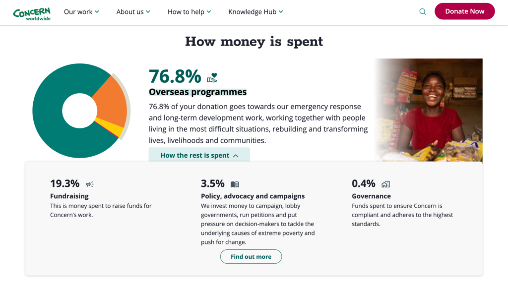
Finally, it is important to provide transparency with users by sharing key information such as breakdowns of how donations are used.
If a user is giving their money to a non-profit organisation they want to know it will go towards those that need it most. It is accepted that some will need to go to administration costs but sharing this information is a better policy than hiding it.
Providing this data alongside graphs or charts helps to build trust in the organisation for the user and remove any potential hurdles to completing their donation.
Final thoughts
There are many aspects that go into a successful donation page. We would always advise that, as well the five points listed, pages also follow usability best practices, accessibility standards and performance metrics. Ensuring your donation page includes all these elements will ensure that you maximise conversions.
At THINK Digital, we are able to help support and implement donation pages and donation campaigns. We can also conduct UX reviews on existing donation pages to highlight areas for improvement. If you would like to know more, please contact us.

