
Last year we wrote about how to build the perfect donation page, focusing on areas such as strong hero sections, engaging storytelling and answering questions. While we discussed some aspects of donation forms, such as placement, as the donation form is such a key component to the donation process, we felt that looking at the aspects that make up a successful one deserved its own post.
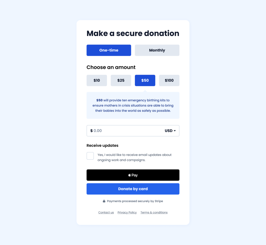
Here is our current best performing donation form. This has been developed based on years of testing. The design of it is made up of four key aspects:
- Freedom
- Aesthetics
- Context
- Transparency
Or FACT for those that are fans of a good acronym!
Freedom
It is essential to allow the user control of the donation form, for them to pick whichever method works best for them. Providing freedom, flexibility and most importantly choice. Of course it’s crucial to strike a balance as too much choice can leave the user feeling overwhelmed and mean they don’t complete the journey, so providing defined options can help.
The ideal donation form would provide choice in the following ways:
- Payment frequency: Providing single and monthly donation options for users to control the frequency of their payment.
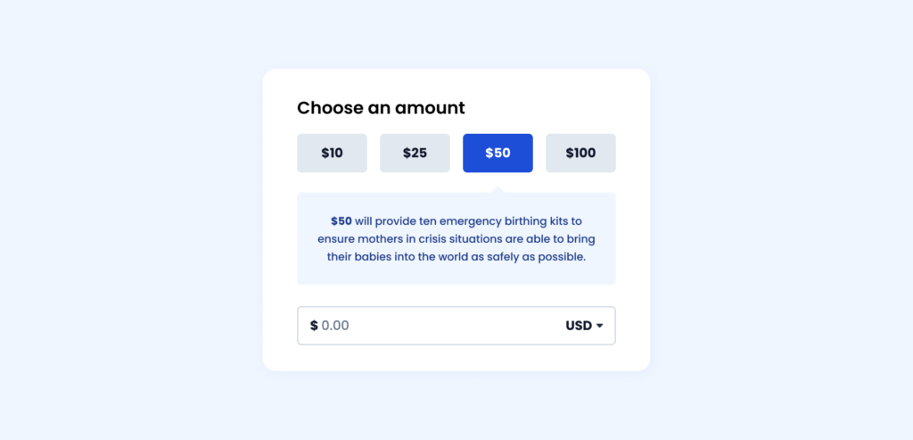
- Donation amounts: Providing multiple suggested donation amounts specific to the appeal. Usually a small, medium, large and extra large amount (see below).
- Other amount: Providing a form field where the user can enter their own amount if needed separate to the donation amounts.
- Currency selection: Providing multiple currency options for the user to select based on their location, language or preference
- Payment methods: Providing multiple ways to donate to speed up the process, including Card, Apple Pay, Google Pay, PayPal as well as local methods such as Direct Debit in the UK or iDEAL in the Netherlands. Platforms like Stripe and Fundraise Up support this.
Some users may want to make a donation on behalf of a friend or loved one, so providing a way to do this such as ‘In Memory’ can support this.
Aesthetics
Creating a functional and usable donation form doesn’t need to be at the expense of good visual design. Providing an engaging but logical aesthetic can help support the process. The ideal donation form priortises this in the following ways:
- Mobile friendly: Providing a responsive design to ensure the form is optmised for mobile devices. This includes sizing elements for touch interaction and reorganising content to follow a logical order.
- Defined colour palette: Providing different shades of branding colours to highlight key areas. For example using a base colour for submit buttons with darker shades for selected options and lighter shades for backgrounds and content (see below).
- Legible text: Providing font-sizing that follows a hierarchical structure and offers a strong contrast to be readable for all users. Using clear headings and labels also helps with this.
- White space: Provide spacing and padding around elements to allow the design to breathe and not feel cluttered. Allowing for this helps to focus elements and provide a logical order to the form.
Context
The primary goal for the user is to make a donation so providing context in the form of visibility, recognition, error prevention/recovery and documentation is vital to ensure this:
- Provide feedback: Inform the user how the form is responding to their interactions. If they have selected a donation amount, the form should reflect this by changing the state of that button.
- Explain why: Inform the user around the impact their donation will make. For example providing text under donation amounts “$25 provides food for a child for one week” or explaining why a monthly donation is preferable.
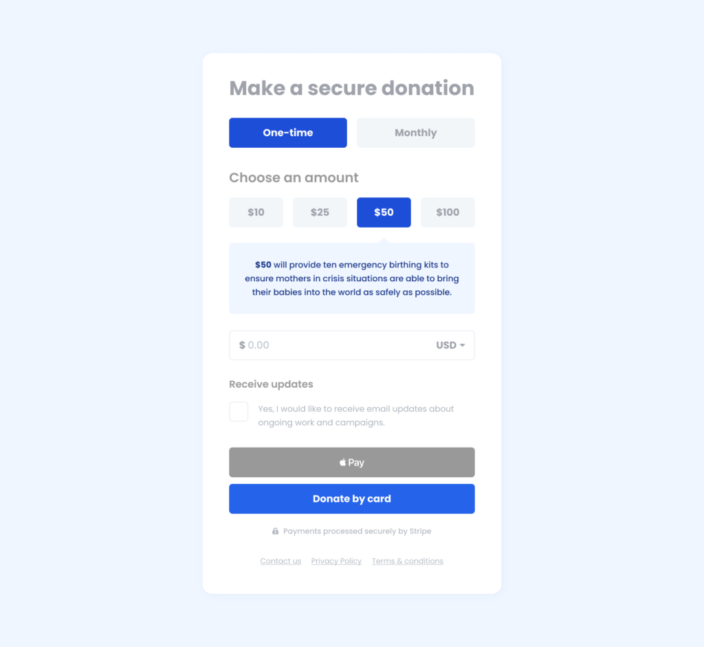
- Error handling: Provide clear messages to help users recognise, diagnose and recover from errors. While error prevention is ideal, users might still make a mistake. Helping them correct this and get back on track is vital (see below).
- Key links: Providing links to relevant pages or sections below the donation form can help to inform the user and answer any questions they might have. This can include FAQ’s, Contact, Privacy Policies or Terms and Conditions.

If it is a long form with multiple steps then providing a step indicator to show the progression can help manage the users expectation.
Transparency
Finally the form needs to be open and transparent to the user by maintaining consistency and standards. Doing this helps to build trust with the user and manages expectations:
- Secure donation: Inform the user how their donation is secure by providing information around the payment gateway and data management. Even providing a padlock icon alongside the form can go a long way.
- Email opt-in: Inform the user that they can opt-in for email updates and what they should expect in terms of information and frequency. Unless exempt, this option should be unchecked by default to conform with GDPR, CCPA etc (see below).
- Essential fields: Only include required fields within your form. Each field adds more time for the user to complete so making it is as simple as asking for only essential information to make a donation.
- Clear buttons: Ensure buttons are labelled accurately to reflect their purpose and inform the user of what to expect next. If using a long form with multiple steps use buttons labelled ‘Continue’ instead.

Testing
So now you have your donation form, it’s time to test it. We have previously written about the value of user testing and how important it is to the design process. The two primary ways we test donation forms are:
- Usability testing: A qualitative research process where users from your target demographic (based on age, gender, device, location etc) are asked to complete a task or tasks related to your product while observed by a facilitator.
- A/B testing: A quantitative experiment process where two or more versions of a variable, such as a landing page or component, are shown to different segments of website visitors at the same time to determine which version has the greater impact.
Usability testing is good to implement during the visual design or prototype stage so you can identify any issues early on where it will cost less to fix before development.
A/B testing is best to implement during the development stage so you can track and measure the results with real visitors.
There are many areas you can look to test including:
- Donation amounts: Try testing higher or lower donation amounts to see how it impacts conversions.
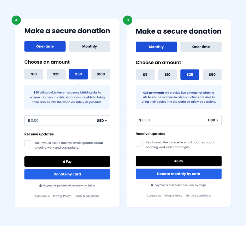
- Monthly vs one-time: Try testing where the monthly or one-time donation frequency is prioritised by default to see if it increases monthly donors (see below).
- Button labelling: Try testing different labelling options on your submit button to see how it impacts conversions and engagement.
- Old design vs new design: Try testing your old donation form vs an updated version based on these principles to see how it impacts conversions.
Using these guidelines alongside good design principles and accessibility standards can help create a successful donation form with a positive user experience that leads to more conversions. If you are not able to easily make changes to your donation form then using third party platforms such as Fundraise Up can help with the process.
